i'm 16 going on 17. An art student. Some people say that i'm not normal. i'm a huge geek, i love tv, i love old music, some of today's music is shit. I'm very bubbly, i talk to everyone and i accept everyone. Any questions, or just want to talk contact me :)
View all posts by anartistworld →
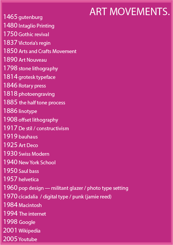
This blog was part of my studies as a Graphic Design student studying graphic design at Mcast Art and Design school in Malta. During school hours, we were given information about different Art Movements and each week we had to write a blog post, talking about the particular movement.
During this unit, I have learned a lot more about design and It made me appreciate the past more.
I was an artist that stuck to a designing things that appealed to me and that was not a lot. I was very interested in finding artists on my own so therefore, having someone show me a lot of movements that did not appeal to me, was at first very suffocating and I resisted it somewhat, feeling forced to learn about things that I did not want to learn.
This was very closed minded of me, of course, I understood that from the start, but it was still very daunting and very tiring producing 500 word essays of things I had no interest in talking about.
I taught myself to be more interested, and seeing a movement and enjoying parts of it that appealed to me. I learned that I did not have to like the whole movement to actually like the movement, intact that could be said about anything in life. You don’t need to love everything about something to still love it.
Of course, there are still movements that are not attractive to me, because I do not like that style, but knowing about them, makes it easier as an artist now, to express myself in my designs. Knowing about a movement, will help me understand more about what I’m trying to convey in my designs and if I think that, a specific movement goes best with my message, I could produce that.
So this unit, helped me be a better artist.
Looking at other artists work has also become easier and in a way, more intimate since I can now look at a design, and know more about what the designer’s intentions were and what his message was that he was trying to portray in his work.
My daily life has also been effected. It is not unheard of that, me as well as a group of my friends that were also taking Contextual Studies, would get into a discussion about a logo we see in the streets.
Considering one of the requirements of passing the unit is to compare artworks from the past to the new, made me think of connection between the past and the contemporary which made me more aware of influences, past designs had on the future.
Artists from the New York School, changed the way graphic design is looked at and attempted. They had simple designs as well as a taste for animation.
Three artists that changed the way graphic design is looked at, are:
Saul Bass, Paul Rand and Herb Lubalin.
These people changed different aspects of graphic design. Saul Bass changed animation whilst Paul Rand logos and Herb Lubalin changed publication.
Saul Bass, (besides title sequences) designed logos for a lot of important companies, most of them still use his designs till today, having a timeless quality to them, since he used minimal and clean designs.
He designed the logos for Kleenex, Bell and also AT&T. He designed logos for about 50 years, being very popular and was the go to man for them.
His work inspired a lot of other artists, such as the cartoon “ARCHER” created by Adam Reed. Which is a show about an alcoholic spy. The cartoon style could be seen as Saul Bass inspired but it mostly shows in the title sequence, were it is very evident that the designer who created the opening, was inspired by a lot of Saul Bass title sequences. Such as “A MAD MAD WORLD” AND “THE MAN WITH THE GOLDEN ARM”
Paul Rand focused more on logos and trademarks.
Paul Rand created a link between european modern art and american commercial art, he also was brave enough not to follow tradition and do what he felt right and be independent.
Designs for logos are still designed in the way Paul Rand did them. Simple and effective, and I believe he had a lot to do with the influence.
“Simplicity is not the goal. It is the by-product of a good idea and modest expectations” -Paul Rand
Paul Rand used flat colours and yet kept compositions Interesting but elaborate.
He Published 3 very important books during his professional life. “Paul Rand: A Designer’s Art (1985)”, “Design Form and Chaos (1994)” and “From Lascaux to Brooklyn (1996)” These books were about the principles he adapted from his life as a professional graphic designer.
Herb Lubalin.
Herb Lubalin worked on 3 magazines. The first being Eros. Eros was a hardbound magazine that had articles of a sexual nature as a well as on love. The magazine had conflicted reviews but had to shut down publication because of the costs it took to do each magazine as well as having legal fees to pay for Federal Obscenity Laws.
The Second magazine he worked on was Fact. This magazine based its topics more on politics rather than intercourse. This magazine had to shut down after writing an article on Gary Goldwater and who was a presidential candidate at that time and they wrote how he was unfit to be president. Mr.Goldwater sued them, and the law suit was so big they had to stop production.
An interesting fact about FACT; the magazine always had a new fact on the front cover.
The Third magazine Lubalin worked on was Avant Garde. This magazine was a mashup of the other two magazines. It had articles of both intercourse and politics. Of course the magazine was also highly controversial but Lubalin had to shut down for a third time, and a final, because his partner, Ginzburg, went to prison for the Obscenity Laws from the first magazine.
Information was achieved from older posts in this blog, and
After he graduated from the Pennsylvania State University’s Graphic Design Programme in 1986
Chip Kidd Graduated from Penn State University , and started designing book covers in 1986 for Knopf. His intention was never to start designing book covers, but was to be a graphic designer, employed by one of the biggest companies in New York City. At the time, all he was offered was a job at Knopf as an assistant director, he took the job and was responsible for 75 book covers a year, (one of them being, Jurassic Park book)and to this day, is still employed by the same company. Now he is an art director, overseeing multiple book covers, even overseeing production of comic book covers for Pantheon. His love for comics, graphic novels and pop culture was a big influence.
One thing he learnt from university was that when designing something, mostly books, as a designer, you either show an image, or text. You do not sure both. That is treating the reader as a “moron” and the reader deserves better.
He was able to put this to the test with the first book covers he had to design with the company. He had two books to design. One being an autobiography and the other a biography. Since the autobiography was like a conversation, text was used for the cover. The biography book, when reading, was like a picture was being painted for the reader, therefore, an image was provided for the cover.
He does not have a particular style, usually sees what is best for the book he is designing and does he best to create interest in the reader to buy the book and look inside. Kidd usually starts by seeing what the book is about, or what the title represents.
A good example of this would be his book design for “DRY” by — which is a book about the authors period in rehab due to alcoholism. Ignoring what he learnt from his typography classes, he wanted the work DRY to represent the opposite of dry. He wanted the word to lie to the reader, just like an alcoholic whose in denial would. His final design was done by printing out the word DRY on a paper along with the author’s name and publishing company, stuck in on the wall and splashed water on the paper. He later scanned it, and printed it on a ‘glossy’ type paper, adding to the ‘wet’ factor he was going for.
I completely agree with his decision to design it the way that he did. I love how his creative process was never thought through. He did what he was was right at the time. Asking the question “what would make this look wet?” and splashing water on it is very clever, and even as an experiment, would have been a good idea to try out. I would have splashed it with more water, making the word “Dry” a bit less recognisable. Overall loved the design and his work.
Chip Kidd: Designing books is no laughing matter. OK, it is. | Talk Video | TED.com. 2014. Chip Kidd: Designing books is no laughing matter. OK, it is. | Talk Video | TED.com. [ONLINE] Available at: http://www.ted.com/talks/ chip_kidd_designing_books_is_no_laughing_matter_ok_it_is? language=en. [Accessed 27 January 2015].
The Book Jacket Art of Chip Kidd – Photo Essays – TIME. 2014. The Book Jacket Art of Chip Kidd – Photo Essays – TIME. [ONLINE] Available at: http://content.time.com/ time/photogallery/0,29307,1853737_1785911,00.html. [Accessed 27 January 2015].
Andy Warhol was born in Oakland in Pennsylvania (Pittsburgh). His real name was Andrew Warhola. His parents were Slovakian immigrants; His father a construction worker and his mother was an embroiderer and loved art.
Andy was bed ridden was a several months due to contracting Chorea, a fatal disease that effects the nervous system. This gave Andrew’s mother a chance to give him drawing lessons. Andrew ended up loving art and he drew all the time.
At the age of 9, his mother brought home a camera, and he also started taking photos and developing film in their basement at home.
His father died in 1942, Andrew took the passed hard, at the age of 14, and did not go to his father’s wake. His father, recognising his son’s talent, left all his life savings for Andrew, to use the money for his college education.
In 1945, he began his studying Pictorial Design at the Carnegie Institute for Technology. This University is now known as Carnegie Mellon University.
Andrew moved to New York City to start his profession as a Commercial Artist, in 1949. Around this time, Andrew Warhola dropped the ‘A’ from his last name to becoming Andy Warhol.
September of that year, Andy got a job with Glamour magazine, and with that job, he became one of the most accomplished Commercial artists of the 1950s. This title got him many awards, getting recognised for his whimsical style and his own unique technique.
He dedicated most of his time in the 50s’ painting and because of this, he launched the concept of ‘POP ART’ in 1961. POP ART was painting that were done with the intention of mass production. The Campbell’s soup cans art work was exhibited in 1962, and made Andy Warhol famous and was known nation wide.
One British artist (Richard Hamilton) described the POP ART style as:
Apart from Coca-cola bottles, hamburgers and vacuums, Warhol started painting portraits of celebrities, some being Elizabeth Taylor, Marilyn Monroe and Mick Jagger. These portraits earned a lot of fame and Andy Warhol got commissioned to do hundreds of paintings from different celebrities and elites.
One of his works, called ‘Eight Elvises’ was sold again for a 100 million dollars back in 2008. This work of art is now the most valuable painting in wold history.
Andy Warhol said this about his concept of POP ART:
“Once you ‘got’ pop, you could never see a sign the same way again. And once you thought pop, you could never see America the same way again.”
It was in 1964, when Andy Warhol decided to open up his own art studio. It was a large warehouse painted in silver and was called “The Factory”. Since it’s opening, the warehouse became a hotspot for anyone that wanted to attend lavish parties. Only the Wealthiest and celebrities were invited to the parties. One celebrity being Lou Reed, who after attending one of the parties, wrote a song about the transvestites and the hustlers that he met at “The Factory”. He called the song “Walk on the Wild Side” and it became widely popular. You can listen to the song:
Andy Warhol loved being a celebrity and was seen in a lot of New York City nightclubs. Studio 54 and Max’s Kansas City were a few of them. Observing himself and the public around him, Warhol concluded that
“more than anything people just want stars”
Warhol wrote several books. His First book Being ‘Andy Warhol’s Index’ published in 1967 and released several move books after that.
In the 70s’ Warhol was also experimenting with film. He produced over 60 films, his most famous being ‘Eat’ which runs for 45 minutes, showing a man eating a mushroom during its duration and ‘Sleep’ which shows a man, poet John Giorno sleeping for the 6 hours during of the film.
He moved to television in the 80s’ hosting two shows. Andy Warhol’s TV and Andy Warhol’s Fifteen Minutes on MTV.
Andy Warhol is still very famous today. In fact he inspired people so much, not only are there tons of imitation of his work, but people also impersonate him.
His character appears on a British show called “Noel Fielding’s Luxury Comedy”
This is a picture of the whole cast in their character costume and we can see the actor depicting Andy Warhol on the far right hand side.
The show had an episode about reality TV and accused Any Warhol of being the cause of it because of his movies. I think that is a very interesting accusation which might be true. Filming people doing nothing, might have inspired people to do the same.
The mighty Boosh and Noel Fielding’s Luxury Comedy are two very creative and imaginative shows that show the artistic side of television. Both Shows have animated aspects to them that contribute to the graphic design aspect.
The Mighty Boosh was created by Noel Fielding and Julian Barratt.
Julian Barratt was born in 1968 on May the 4th. He is both a comedian and a musician, and played with bands like “LITTLE CHIEF” and “THE GROOVE SOLUTION”.
Noel Fielding was born on the 21st of May in 1973. He’s from London, England. There isn’t a lot of information about him on the internet, he has said himself a couple of times in interviews that he likes his privacy.
He studied in Croydon, studying Fine Arts there and later started his Stand-up comedy act.
He’s known mostly for his involvement in the cult TV show, The Mighty Boosh. I mention the fact that is a cult TV show, because it was never actually main stream and it did very poorly its first two seasons. Like all great TV shows, it was ahead of it’s time and not appreciated at all by the people watching it.
The show is very artistic and uses (especially in the later episodes) different mediums to portray the episode’s story.
Between costumes, animation and music, the Mighty Boosh episodes end up being an art of their own.
The show surrounds two best friends that work in a ZOO together. The two characters could not be more different, one being eccentric and a wannabe rockstar (Noel Fielding) and the other, a no nonsense guy that loves jazz music much like Julian Barratt himself.
They are accompanied by a talking gorilla and a shaman throughout all 3 seasons but their journey through life is always different. From being ZOO keepers in the first series, moving to a different place to become rockstars in the second and opening a shop in the final series.
The show worked so well because the two main actors were actually best friends in real life and the audience could literally see different aspects of their characters in the show.
While Julian Barratt produced all the music on the show, giving the show that artistic feel to it, Noel Fielding was the artist, producing all the animation in it.
Every episode has the theme song in the very beginning of the show. The theme song could be heard below.
The theme song alone, gives you a very good idea of what you are about to see in the episodes and it is very well designed to attracted the viewer with a catchy theme song and a very nice visual, with animation.
The cartoon style when explaining parts of the story in episodes appear as 2D animations, with objects mostly looking like paper cut outs.
When the show ended, Noel Fielding created another show; Noel Fielding’s Luxury Comedy.
This show appeared to be more random than the first one, but there is order to the madness.
The show has a very colourful colour scheme. The majority of the show being a shade of blue, red and yellow.
It has a lot of stop motion animation, this appears mostly when unrealistic characters show up.
Noel Fielding was inspired by a lot of artists when creating the show. One of the artist he was inspired by was Henri Rousseau. Rousseau was fascinated with the jungle although never visited it. So he always drew from his imagination what he thought the jungle looked like. Fielding loved the idea of this. The imagination was far better than reality.
Another artist he was inspired by, was Salvador Dali. As a kid he always saw the giraffe on fire in Dali’s paintings and he always used to think “That’s everything I want to do.”
Artists such as Alejandro Jodorowsky, Richard Brautigan and Ayrton Senna also inspired him to create the feel of the show.
The alphabet was not always the way we know it today. It was once a collection of symbols of objects we see everyday, and also a distortion and a more abstract approach to some objects.
Cave paintings date back to 20,000 BC and are the first pictures, but it was around 17,000 years after that, that written communication was first recorded. It was around 3500 BC by the Summerians. These, used simple drawings of well known objects, known as pictograms, to recored stories.
As time went by, civilisations began a want to communicate more as well as more complicated stories. Egyptian Hieroglyphics started using more symbols to represent their ideas by 3100 BC. With the addition of these extra symbols, they began being called ideograms. The symbol for food would be an ox and the combination of a setting sun with a man, would be to communicate death or very old age.
Ideograms are considered to also be in the Roman numbers. The numbers 1 to 3 representing fingers on the hand and a V would be an open hand.
The Phoenicians had found a way to develop symbols for the spoken sounds. these were called phonograms and were developed around 1600 BC. Since they created symbols for sounds, the Phoenicians are generally responsible for creating the first alphabet. They spread the alphabet with the Western Side of the World since they were primarily a merchant society and made a lot of trades with many cultures.
Around 1000 BC, the alphabet of that time was adapted by the Greeks, these developed the many handwriting styles, created the art of handwriting.
The word “alphabet” came from the Greeks, their two first letters; the letter Alpha and Beta.
The Romans started using the Greek alphabet for their uppercase alphabet. This is still used today. The Romans also improved on the art of handwriting, creating more styles which can be used for different purposes. Rigid, formal scripts for important documents while a quicker style was used for informal letters. They had a blooming book industry by AD 100 and the evolution of handwriting continued to flourish. This included lower case letters and very early forms of punctuation.
For the next 1,000 years, handwriting and the alphabet continued to be developed and manuscript preparation became a highly respected craft. Books were highly appraised and of great value, and had amazing works of illustration covering their pages. Books took so long to perfect every single page, that it was very common for a monk to spend his lifetime perfecting just one manuscript.
Printing was practiced before the famous,Johann Gutenberg, but he is often credited to have invented the printing press. What Gutenberg did, was perfect what was already a craft. Type had been cast successfully, but very roughly, several years earlier in the Netherlands and several hundred years before, in China. Johann Gutenberg made practical machines for type, in 1445 in Mainz Germany.
Johann Gutenberg.
Johann Gutenberg, improved on the workable system of moveable type, creating a process of a separate matrix for each alphabet character. These could be assembled next to each other, and form sentences next to each other that then could be imprinted on paper using special inks.
As a result of the invention of the perfect printing press, the next 50 years saw a widespread distribution of books in Europe, as well as a great demand for them. by the year 1500, 10 million copies of almost 3500 manuscripts were printed and sold all over.
The invention of the Monotype machine in 1889, was much like the Linotype machine. Each key stroke created a perforated tape. the operator would then take the tape and run it though a casting machine. This produced a mould with the characters. The monotype was easier to correct mistakes one would have made during typing, because it was possible to remove just one character than a whole row of type. It also was of a finer quality, so it was used frequently for books. Linotype was then mainly used for newspapers.
Young adults in the 1970s’ hated being spoon-fed and told what to do by the media, which seemed that it could not care less about their age group. This started a wave of rebellious bands, inspiring themselves from the 1950s’ rock and roll music and remixing them by playing more rock. Turning up the volume as well as increasing the speed of songs.
Two cities that were in the centre of the Punk Rock subculture, where New York and London. Bands such as “The Ramones” (Starting in New York City) and “The Sex Pistols” in London helped spread the popularity.
The Punk movement was all about getting access to the people. Their DO IT YOURSELF posters and magazines, were all about practicality and not mass production. Bands created their own sleeve covers for albums, and concert flyers.
Their Collage style was made famous by the album cover for the Sex Pistol’s band. Their first album release, had the Queen on the cover, which created immense controversy. The Queen was shown with her eyes and mouth covered by typography. The artist of this cover was Lou Reed. He took inspiration from the ransom notes to produce the typography for the cover. Getting letters from random magazines. The ransom note style projected anger and protest and this was very controversial. A sense of people demanding to get what they want , was what punk music was all about.
The style for the culture was all about re-making mainstream culture. Punks saw the mainstream culture as stupid and therefore wanted to make it better. It consisted a lot of cut and pasting, much like the DADA movement, preferring the scissors over paintbrushes. Taking the old and re-using it was also a big part of the Punk Culture.
The Cut and Paste technique could be seen on the album cover “Orgasm Addict” which was from the band “Buzzcocks”. The band Cover showed a naked female body, but replaced the usually censored parts as well as her face, with ordinary objects.
Album covers weren’t the only thing Punk culture produced. Hand made magazines were also popular. A magazine that was very popular amongst punks was the magazine “Sniffin Glue”. This was a amazingly influential , since it showed anti-consumerist perfect world as well as information on the local music scene. The magazine was usually hand drawn, with doodles and images with writings on them. The logo and the cover were usually hand designed. This showed the urgency of the culture. Magazines were usually stapled and passed around, usually people doing copies for other people, instead of the person that made the actual magazine doing a mass production of it.
Since the punk culture was based on parodying the main culture, “The Ramones” parodied the president’s government logo. They did this to show that the band was as American as it can get. Although they usually do not like to be associated with the government and its views, by showing the logo as their logo, they showed that they were connecting people together with their music as well as being the real leaders of the free world and not the government.
Paul Rand was born in 1914, on August 15th, and was the child of a conventional Jewish household where he lived with his parents in Brooklyn, New York. His real name is Peretz Rosenbaum. Rand would copy pictures of models that would have been displayed on the advertising stands and posters that where placed in different places in his father’s grocery store. By doing this, Paul Rand was breaking, strict Jewish laws, which prohibits any images used with the intention of worship.
To his father’s dismay, Paul Rand attended night classes at the Pratt Institute in Brooklyn. This would not affect Paul Rand’s life a lot, he mentioned that the school did little to help with his creative process. In fact, Rand identifies as a self taught designer meaning that he was not professionally thought.
He spent most of his time in bookshops, there he discovered two magazines that opened up the world of Bauhaus thinking. These magazines were “Commercial Art” and “Gebrauchsgrafik”.
Although Graphic Design was not mentioned at he Pratt Institute, Rand knew he wanted to work on the commercial aspect of it.
He was hired as a freelance designer in 1936, doing layouts for a men’s fashion magazine; called “Apparel Arts”. His layout designs were experimental and depended on the viewer’s intelligence. Once he gained the trust of the magazine’s editors, he was able to experiment at will, and ended up getting a full- time job as well as an offer, to direct all artworks for the popular magazine “Esquire”.
Being an Art director for the “Esquire” magazine, did not stop him from spreading his creativity onto other magazines; doing freelance work for a cultural magazine called “Directions”.
“When i was doing the covers of Direction i was trying to compete with the Bauhaus, Van Doesburg, Leger and Picasso. Compete is not the right word, i was trying to do it in the spirit.”
In the 1930s’, a senior at “Esquire”, William Weintraub, sold his shares and opened an advertising office of his own. He asked Paul Rand to become the chief art director at his agency and Rand accepted.
Instead of using popular calligraphy fonts, Rand frequently used “futura”. He also used very simple designs for his ads, which turned out to be more eye catching than the typical ads that ran at the time.
Although being simple, his ads had one goal and that was to communicate with the viewer. He wanted the common man on the street to understand what Paul Rand was trying to sell.
book cover by Paul Rand
Most of his ads were often a mixture of visual puns and visibly hand drawn sketches. He has a different style for book covers; doing a mixture of shapes, objects and having a palette of different colours. He loved reusing objects, cut papers into other shapes and use minimal typography. He usually added his own typography, to add “friendliness” to the piece.
‘a logo is more important in a certain sense than a painting because a zillion people see the logo and it affects what they do, it affects their taste, it affects the appearance of where they live, it affects everything.” – Paul Rand
Paul Rand loved creating trademarks and logos and saw great importance in it, and he continued doing it till he died in 1996 on November 26. He died at the age of 82.
This is how the IBM logo changed through the years.
Paul Rand created a link between european modern art and american commercial art, he also was brave enough not to follow tradition and do what he felt right and be independent.
Designs for logos are still designed in the way Paul Rand did them. Simple and effective, and I believe he had a lot to do with the influence.
Paul Rand – iconofgraphics.com. 2014. Paul Rand – iconofgraphics.com. [ONLINE] Available at: http://www.iconofgraphics.com/paul-rand/. [Accessed 29 December 2014].
Saul Bass was the child of Jewish immigrants. They lived in New York City, where Saul Bass was born in 1920. As a child, he was always very creative, drawing every chance he gets. He went to college at the Art Students League, attending night classes at the school, studying under the teachings of Gyorgy Kepes who was a master at making art that was functional and had Bauhaus aesthetics.
Carmen Jones. Movie Poster.
His rise to fame in the filming industry came after he created the movie poster for the movie Carmen Jones by Otto Preminger in 1954. Film makers were very impressed with his work and started hiring him for movie poster designs. His opening to start title sequences came after Otto Preminger told him to do the title sequence for the very popular movie, “The Man with the Golden Arm” which was directed by Otto Preminger himself; in 1955. The movie was about the struggle a jazz musician had trying to overcome heroin addiction. Since the subject was very taboo and not talked about at all in the mid 50s’, Bass decided to make an equally controversial title sequence. He chose to symbolise heroin addiction by placing a cartoonish hand which looked broken, at the end, before the movie started.
Saul Bass also worked for the legendary Alfred Hitchcock. He helped him set the story from the beginning of the films, creating very creative and imaginative title sequences for two Alfred Hitchcock movies. Vertigo and Psycho.
The “Vertigo” title sequence captures the audience’s attention from the beginning. It has a creepy first visual of half a face and while the camera slowly pans upwards towards the eye. The camera finally settles on the eye and zooms in. Special effects start appearing from the eye. Lines start forming and moving in circular motions to represent vertigo. the eye disappears but the special effects stay there, changing its form. The eye reappears at the end of the title sequence. The whole visual is very effective because Bass did a very good job at understanding what the movie was about and showed that perfectly in the title sequence that prepared the audience and showed them what to expect from the movie.
Saul Bass’s choice of visuals in the title sequence for the movie PSHYCO was a brilliant one as he only used light and dark lines throughout the whole sequence to represent the movie. His choice to use both negative and the positive space from the lines was very similar to what the movie does to the audience. People watching the movie, are left in the dark till the very end about what is actually going on in the movie. The title sequence also uses to show the word “PSHYCO” broken up between the lines. Similar to what would look like a glitch right now. I believe that represents the two sides of the main character and also his mixed feelings and his conscious.
Saul Bass also designed logos for a lot of important companies, most of them still use his designs till today, having a timeless quality to them, since he used minimal and clean designs.
He designed the logos for Kleenex, Bell and also AT&T. He designed logos for about 50 years, being very popular and was the go to man for them.
His work inspired a lot of other artists, such as the cartoon “ARCHER” created by Adam Reed. Which is a show about an alcoholic spy. The cartoon style could be seen as Saul Bass inspired but it mostly shows in the title sequence, were it is very evident that the designer who created the opening, was inspired by a lot of Saul Bass title sequences. Such as “A MAD MAD WORLD” AND “THE MAN WITH THE GOLDEN ARM”


